The Power of Color in Branding: How to Choose Colors That Last and Connect
Let’s talk color. Sure, it’s pretty to look at, but when it comes to branding, color is the secret that makes your brand pop, resonate, and stick in people’s minds. And as we get ready to roll into 2025 (seriously, where did the time go?), now’s the perfect time to give your brand’s color palette a little TLC.
Why? Because in a world that moves faster than we can keep up with, your brand’s visual identity needs to stand the test of timeand feel fresh. It’s all about that balance. So, let’s dive into how you can pick colors that don’t just look pretty but also work for you in the long run.
What Even Is Color Psychology?
Before you start picking out Pantone swatches, let’s get into what color psychology really means.
At its core, it’s all about how colors affect human emotions and behaviors. Basically, colors aren’t just decorations—they’re influencers. Blue makes us feel calm and secure, red gets us excited, green says “hey, I’m all about balance and growth.”
When used strategically in branding, color psychology helps your business speak to your audience on an emotional level. So, whether you’re a coach, a service provider, or a creative, your color palette should do more than just look good—it should feel right.
2025 Color Trends to Watch
Now, I know we’re all about that timeless look, but keeping an eye on trends can help you stay current while still being true to your brand. So, what’s trending for 2025?
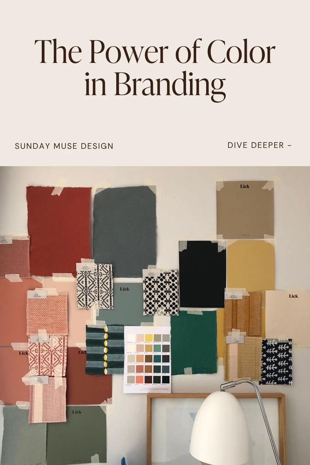
Ethereal Blues and Greens: Think soft, calming, nature-inspired vibes. These colors say, “Hey, let’s slow down and connect with what matters.”
Bold Ebony: Deep blacks are making a comeback, and they’re giving all the sophistication and drama your brand might need.
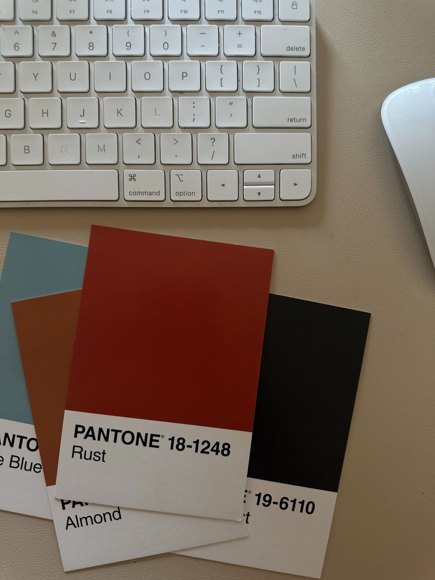
Warm Earth Tones: We’re talking rich, cozy yellows, browns, and terracottas. These tones feel like a warm hug (hey, Olaf) and tap into that sense of groundedness everyone’s craving right now.
Vibrant Accents: Don’t worry, it’s not all muted—there’s room for some bold, electric pops of color like coral and bright blue. Just enough to add some energy without overwhelming your palette.
In 2025, people are looking for both calm and excitement—kind of like the feeling you get from sipping a really good cup of coffee while watching a thunderstorm. It’s all about balance.
Colors That Speak to Your Clients' Hearts
Here’s the thing—color isn’t just about you, it’s about how your audience feels when they interact with your brand. Want to build trust? Make them feel excited?
Here’s a cheat sheet:
Blue: Trust, calm, professionalism. A classic choice for service-based businesses or industries where reliability is key.
Green: Growth, health, balance. If you’re in wellness or anything eco-friendly, this is your go-to.
Red: Excitement, passion, urgency. Perfect for getting attention in retail or high-energy brands.
Yellow: Optimism, warmth, clarity. If your brand’s all about positivity, yellow might be your best friend.
Purple: Creativity, luxury, wisdom. This one’s great for beauty, fashion, or anything high-end.
Orange: Enthusiasm, adventure, confidence. Perfect for brands with bold, energetic vibes.
Know Your Clients, Know Your Colors
Not all clients are created equal—some love adventure and boldness, while others are all about comfort and calm. So, how do you match your brand colors to the right people?
Bold, vibrant colors: These are for the risk-takers, the extroverts, the go-getters. If your clients are movers and shakers, think reds, oranges, and electric blues.
Soft pastels: These attract people looking for peace and comfort. They’re the homebodies of the world—think soft pinks, light blues, and muted greens.
Earth tones: Nature lovers and authenticity seekers will flock to browns, greens, and warm neutrals.
Monochromatic schemes: Minimalists rejoice! Black, white, and greys speak to those who love simplicity and sophistication.
The key? Know your audience. You wouldn’t use neon pink to attract a crowd of conservative investors, just like you wouldn’t slap grey on a brand targeting creative entrepreneurs.
How to Pick Colors That Stand the Test of Time
Here’s where the fun (and strategy) come in. Trends are cool, but you don’t want to be stuck rebranding every year. So, how do you make sure your colors stick?
Stay True to Your Core: Make sure your colors reflect your brand’s values. If your business is all about calm and trust, stick to blues and greens—don’t go chasing neon pink just because it’s trendy.
Look at the Competition: What colors are they using? How can you stand out while still feeling relevant?
Test It Out: Don’t be afraid to try different color combinations with your audience. Their feedback is golden.
Think Long-Term: Yes, trends are fun, but you want your brand to look just as good in 5 years as it does now. Choose colors that won’t make you cringe in a year.
Practical Ways to Use Color in Your Brand Strategy
Now that you’ve got your colors picked, let’s talk about how to actually use them. Here’s where the magic happens:
Website Design: Use your primary color for call-to-action buttons (trust me, you’ll see more clicks) and accent colors to draw attention to important info.
Packaging: Your packaging should reflect your brand personality. Think of it like wrapping paper for your product—it should give the right first impression.
Social Media: Keep your feeds cohesive by sticking to your color palette. It makes everything look polished and on-brand.
Logo Design: Make sure your logo colors align with your brand’s vibe and attract your ideal clients.
Even small tweaks to your colors can change the way people interact with your brand—so choose wisely!
Why Color Choices Actually Matter for Your Bottom Line
Let’s get real for a second—color isn’t just about looking pretty. It affects your bottom line. Studies show that color can increase brand recognition by up to 80%, and even something as small as changing the color of a call-to-action button can increase conversions by 21%. So yeah, it matters.
The brands that nail their color strategy aren’t just riding the wave of trends—they’re building trust, loyalty, and longevity. And as we head into 2025, getting your colors right will be more important than ever.
Ready to Get Your Color Strategy Right for 2025?
Let’s make your brand as visually compelling as it is powerful. If you’re ready to elevate your brand with a color strategy that resonates, lasts, and connects, book a Creative Kickstart session, and let’s get to work.


