A Rebrand Story: Sunday Muse Design—a Creative Studio
It’s the day before my [re]launch…and tbh, I can’t believe it’s finally here.
I’m feeling all-the-things:
-
excitement
-
relief
-
anticipation
This has been a labor of love.
So much has gone into this rebrand.
Time, energy, revisions, early mornings, late nights, texts, Voxers, emails, random notes scribbled on sticky notes, an insanely large Notion board with brainstorming and planning notes…
Needless to say, I’m thrilled to officially introduce you to Sunday Muse Design—a place where laid-back Sunday vibes meet strategy and style.
Here’s the thing…while I started thinking about this “new” chapter at the end of last year, it’s been here all along.
and while I officially decided to change the name of the brand in early 2023 (and actually started transitioning clients over to it during the Spring…pssst… thank you, dear friends, for keeping this a secret with me!), the heart of the brand has always been here.
What hadn’t been here?
The clarity.
And while it’s taken me longer than I anticipated to bring this to fruition, I’ve been working on it daily.
If you’ve been here long enough, you know that I’m a perfectionist. And you also know that I’m trying to learn how to lean into “done is better than perfect” and just do things messy sometimes.
But I didn’t want to do that with this rebrand.
I wanted to do this right.
I wanted to be proud of this.
I wanted it to resonate with you.
My goal for Sunday Muse Design is for it to feel like a breath of fresh air while empowering you. I want you to feel inspired, relaxed, and welcomed.
So… welcome to the chapter I skipped over but has somehow always been here
Why did the rebrand even happen?
The short answer? Because the old brand no longer resonated.
The long answer?
I outgrew the old brand.
My business has evolved quite a bit over the past few years. Services added. Services removed.
I was pouring myself into educating myself and improving my skills.
There was tremendous growth, and the old brand no longer fit.
It also no longer represented the clients I was working with… or the ones I wanted to work with.
And it just didn’t feel right. Something felt ‘off’.
And so… I jumped into rebranding.
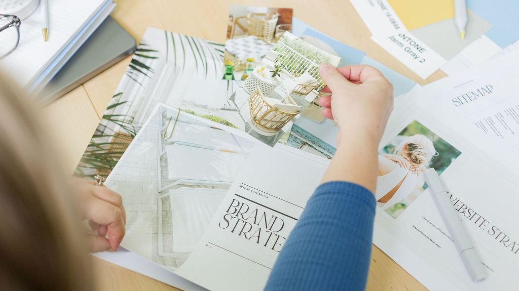
The Brand Strategy
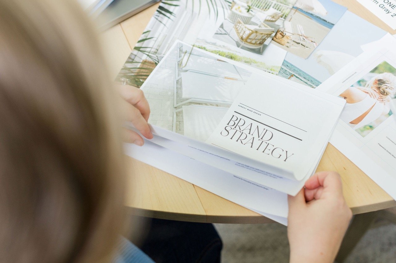
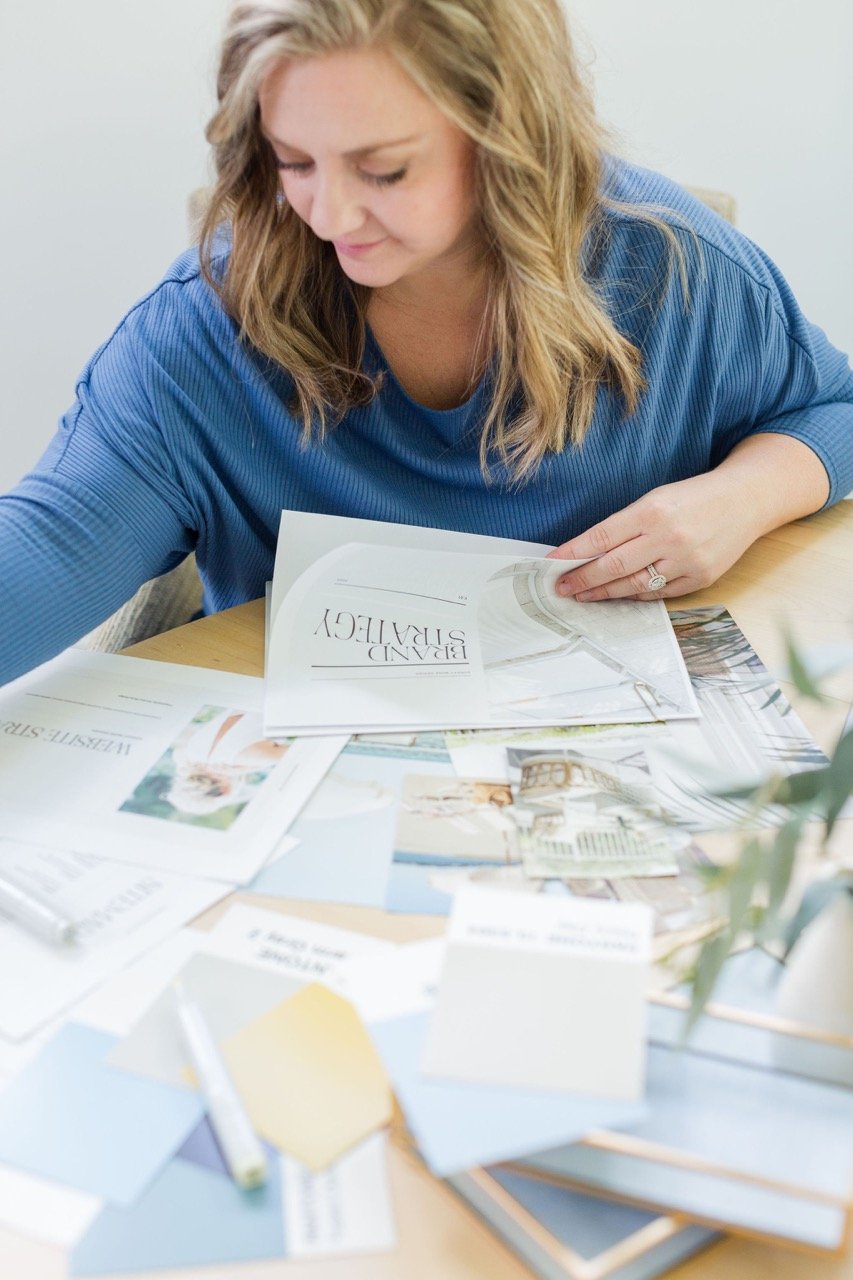
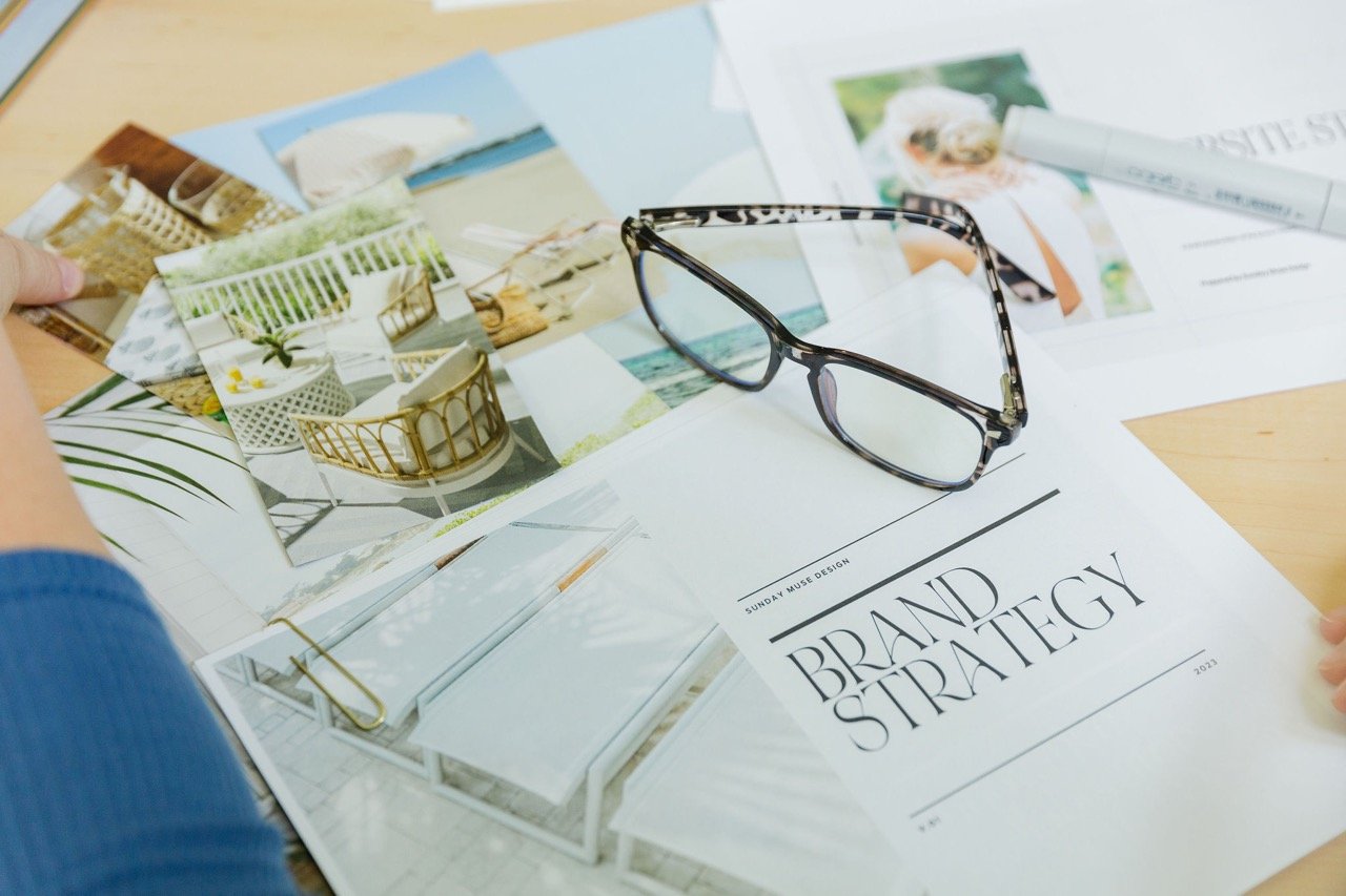
I always tell my clients and audience about how important a strong brand strategy is to your business and the success of your brand… but I didn’t have one of my own.
Womp womp.
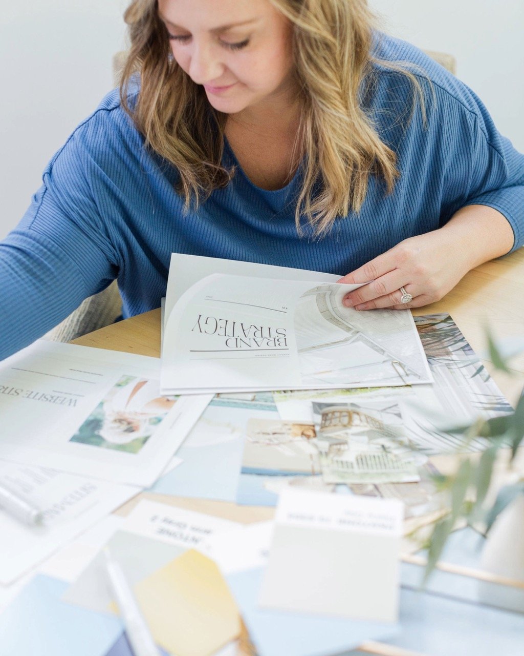
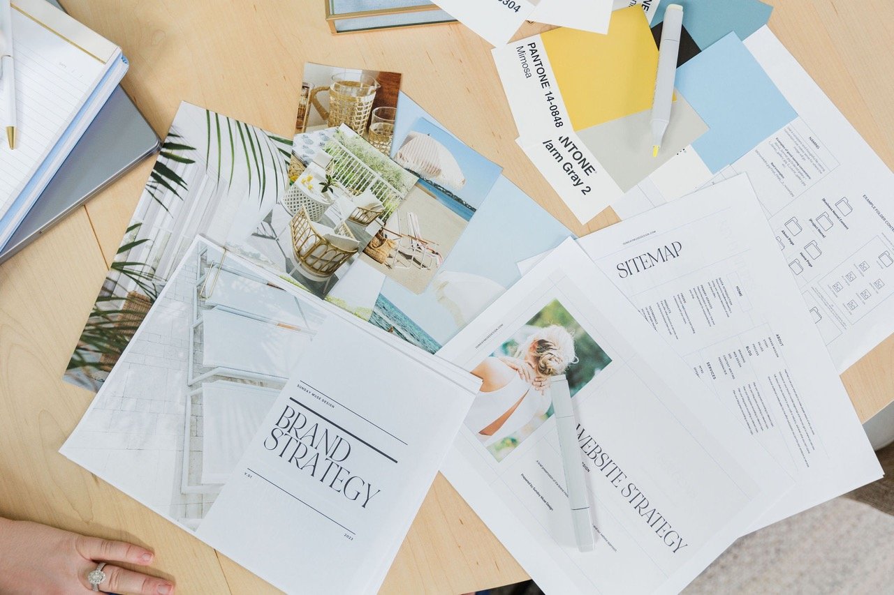
So I spent a great deal of time really getting to the heart of my brand… the identity, the ideal client, the positioning, the voice, and the presentation. Gosh, my notes for this part of the process are extensive. Like… longer than a CVS receipt.
Let’s talk about some of it.
Our identity
I don’t want this to be just a design studio. I don’t want to give you a set of deliverables, wipe my hands, and be done. I want this to be more.
So… I’m not just a designer—I’m an experience creator.
My goal is to craft digital experiences that are intuitive, impactful, and unforgettable.
And I specialize in creating purposeful designs that evoke emotion, spark conversation, and drive action… all while ensuring functionality and effectiveness.
Our vision and mission
I’m here to help you create a ripple effect of positivity, connection, and growth in your business and the community you serve…
Because chances are, you’re in this for the long-haul.
You want to:
-
make an impact and build a legacy
-
increase revenue and profitability
-
gain confidence
-
create a strong, consistent brand experience
-
and be positioned as a go-to authority in your field.
So I’m here to help passionate entrepreneurs like you elevate their businesses, connect with their audience, and drive growth and success.
Our values
Defining these took some introspection but at the same time…they feel inherent. These are taken straight from our Brand Strategy Guide.
Side note: I keep saying “we” and “our” and “us” because eventually, this team will grow.
Humanity fuels our success.
We prioritize people over profits and collaborate to create experiences that leave a lasting impact.
Fiercely advocate for what’s right.
…even when no one’s watching. Integrity is a top priority.
Elevate the standard.
We don’t just aim to meet expectations. We exceed them. Our unwavering commitment to excellence drives us.
Unleash your imagination.
Creativity is at the heart of every great project. We encourage free thinking, inspire new ideas, and empower our team to take bold, innovative steps toward originality.
Constantly push the envelope.
We embrace new ideas, technologies, and methods to create digital experiences that break boundaries and set new standards.
Our People
Sunday Muse is for the fearless, the ambitious, the brilliant, the humble, the passionate, and the uninhibited dreamers and doers who want to make a positive impact on the world.
These are the ones who believe in the power of design to tell their unique story and inspire others.
Sound like you? Let’s go ahead and chat!
We want you to feel empowered, inspired, confident, valued, clear, aligned, and energized.
Our Voice, Tone, and Personality
Our voice is engaging, evocative, and relatable.
Our tone… personable, professional, and transparent.
Our personality is personable, welcoming, sophisticated, transparent, supportive, creative, modern, and stylish.
Is it any surprise there are similarities and overlaps?
The fun stuff
If Sunday Muse Design were a Cocktail: It’d be a French 75—a classic, elegant drink that exudes sophistication and refinement. The combination of gin, champagne, lemon juice, and a touch of sweetness creates a balanced and complex flavor profile while the bubbles give excitement and energy.
If Sunday Muse Design were a flower: It’d be a peony. Lush. Full. Beautiful.
If Sunday Muse Design were a decade: It’d be the ‘60s—a time of creativity, innovation, and expression.
If Sunday Muse Design hosted a party: It’d be a late-afternoon/early-evening, Welcome-Summer Party at a beach house or beach club. Signature cocktails would be served—a French 75, classic mojitos, and a “Summer Fizz” (I like to think of this one with champagne, elderflower liqueur, fresh lemon juice, and sparkling water). The decor would be inspired by the ocean with blue, green, and neutrals dominating the color scheme. There’d be plush white sofas and chairs, and a mix of rattan lanterns and twinkle lights casting a soft glow as the sun sets. Large potted plants would be placed effortlessly around the area. A live band would play a mix of classic and modern hits in the background. Charcuterie boards, grilled shrimp skewers, and caprese salad skewers would be passed around. Overall, it’d be chic and sophisticated while setting the tone for the rest of summer.
Can you tell I used to be an Event Planner & Designer?
The Visual Identity
Arguably one of the most fun parts of this process.
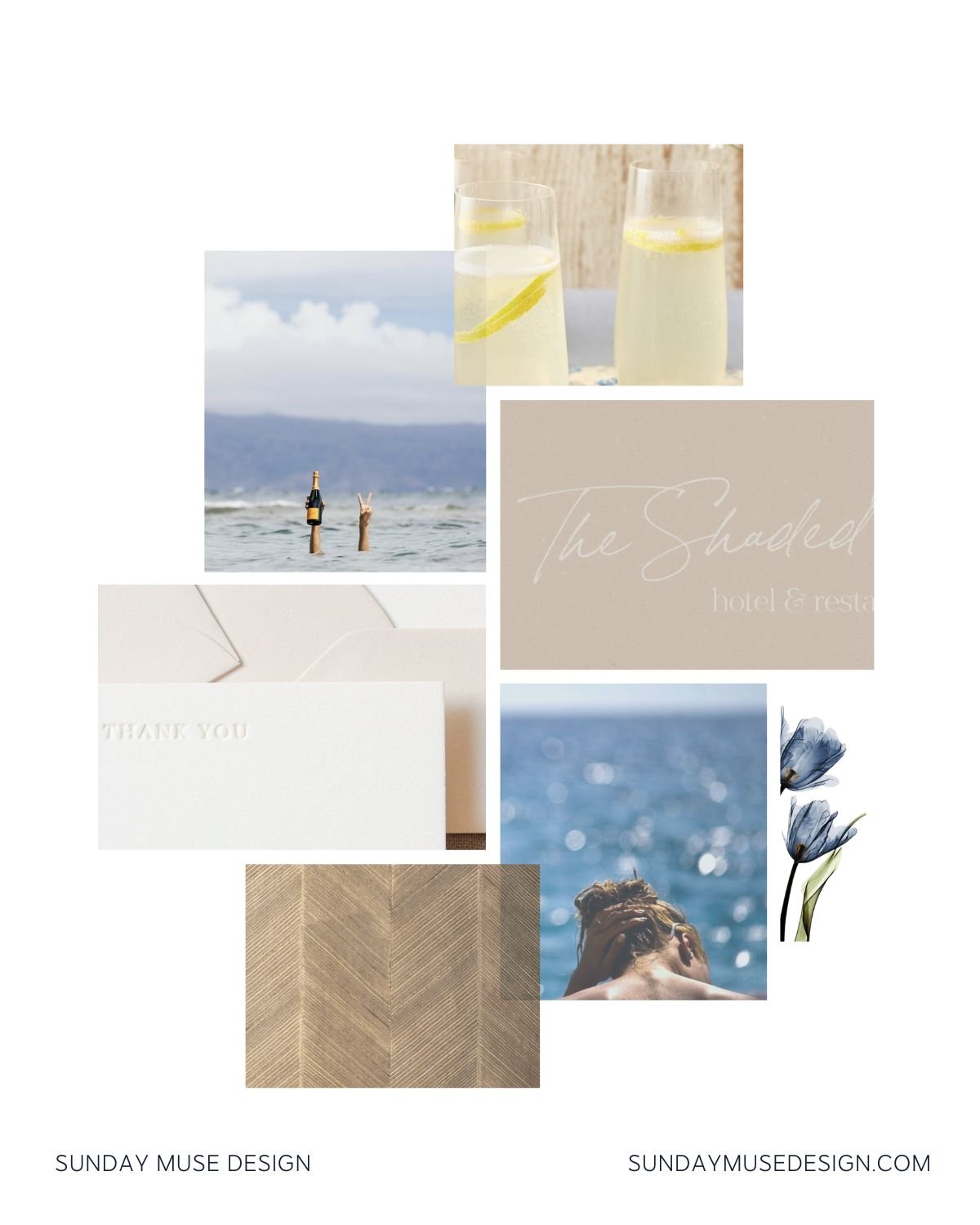
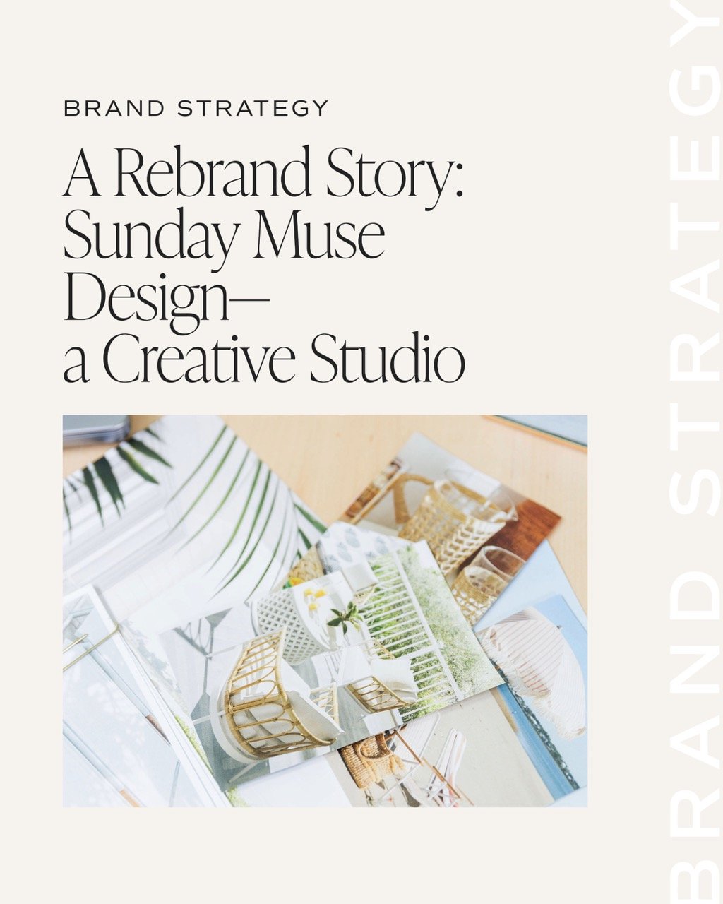
I could have pinned images for dayyyssss… Click here to see the full brand inspo board.
In the end, I chose images that felt like a reflection of my brand values, mission, voice, and personality.
Image Credits:
French 75 | Veuve in Ocean | The Shaded Palms | Stationery | Woman in front of ocean | Blue tulips | Chevron texture
The Color Inspiration
Ok. Let’s state the obvious: I love a good black, white, and cream.
But I also love blues. Greens. and the occasional bright pop of color.
So after lots of refining, I ultimately settled for a new black, a new white, a cream (getting rid of the old light gray), and a dusty blue that borderlines teal (scrapping the old mauve).
I went back and forth between whether to use green or a dusty rose… and ultimately added them as optional colors when I needed a random pop of color or highlight.
The Logo and Fonts
Oh the logo. And the fonts.
I think as a designer these are hard for me because there are so many fun options out there.
I went through SEVERAL different logo iterations… and SEVERAL different fonts.
How’s a girl to choose?!
I knew I wanted a serif font and a sans serif… and likely an additional sans serif for buttons, eyebrow text, and other accents.
And as much as I love…like have an unnecessary obsession with… IvyPresto Display and Editor’s Note fonts… soooo many brands in my industry are using them. So I took a deep breath and pushed them to the side. And I went with Quincy CF for my header font…it’s a little vintage, warm, and smooth.
I chose Source Sans Pro as my body font. It’s simple and clean. Easily readable (important for web).
And I have Bon Vivant Script, a handwritten script font, for my accent font that I use very rarely.
And as far as the logo goes, I’m a big believer in simplicity… and unless you’re using printed materials (I’m not), a simple wordmark logo is perfect for web.
The Website Design
Honestly—this was probably the hardest part for me.
I know too much.
I know what’s possible.
I stare at websites every single day… so while it’s easy for me to know exactly what I don’t want… trying to keep the new site simple with a few key features was HARD. Because I really just wanted to implement all-the-things, lol.
But I practiced self-control.
You’ll find similar designs and layouts throughout the site to maintain consistency.
You’ll find subtle animations to keep the site dynamic and interesting.
You’ll find a focus on my services, products, and resources to help YOU.
The Brand Photoshoot
UGH. If there’s one thing I don’t like it’s being in front of the camera. Just ask any photographer that’s ever taken photos of me. I’m awkward.
So while I didn’t WANT to do a brand shoot… I knew it needed to happen.
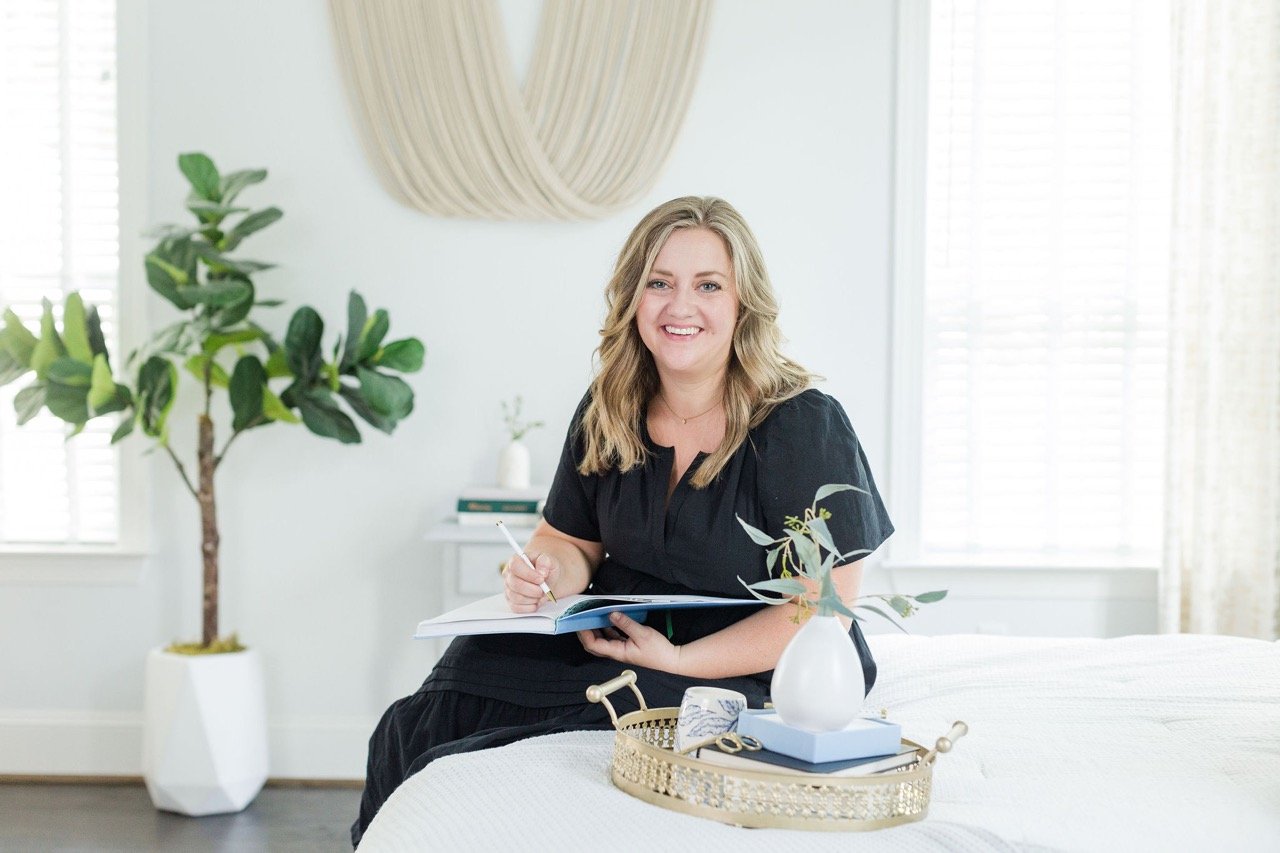
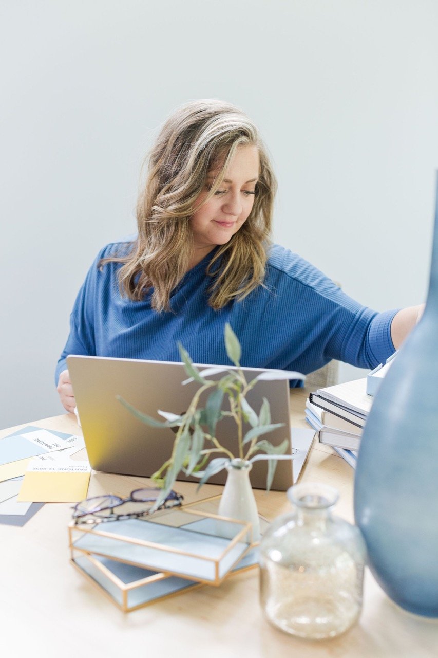
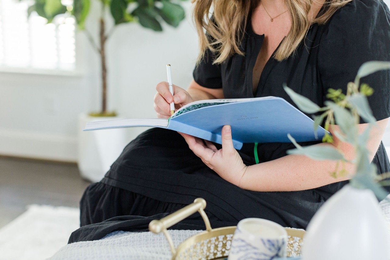
Using my Photoshoot & Imagery Strategy to guide me, I gathered inspiration… a sampling of poses, angles, and props. I hired a photographer, and we scheduled a date.
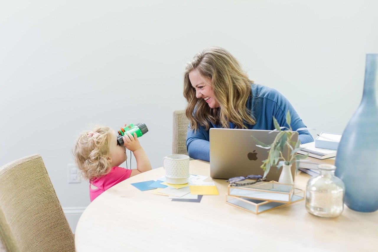
Lo and behold—I lost my childcare that day (of all days!) and my tiny human ended up accompanying me to the photoshoot. I threw some toys in the car and loaded her in with all my props and outfits.
And honestly, she did pretty great. It was also a subtle reminder that I wanted to be able to work from home with my daughter… and here she was getting to witness part of it all.
Alyssa even caught some cute moments throughout the shoot
The Digital Shop
If you’ve been around a hot minute you know that I’ve been hinting at a digital, online shop for…ahem, awhile.
It’s fi. na. lly. herrrreee!!!!
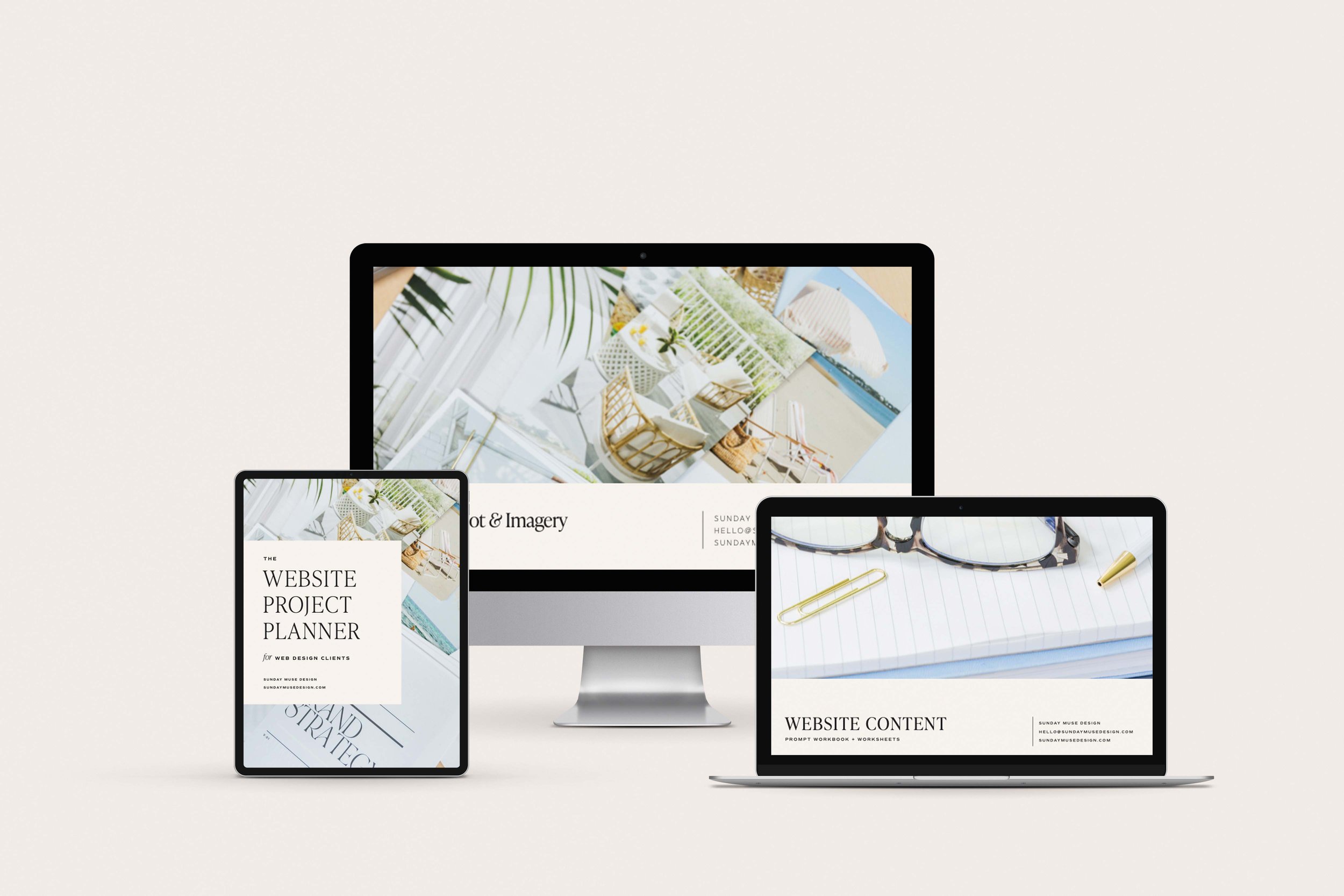
Currently you’ll find some of the best tools to help you plan and prep for your website design. Whether your DIY-ing it or hiring a pro, these 3 resources will set you on a firm foundation to a successful project.
I plan to add more products and Squarespace website templates later, so if you want to be one of the first to be notified of those additions (and always launch promos to boot!), grab a spot on my email list.
Ok, whew. That’s it for now. Bottom line—I am PUMPED to finally get this out in the world (at least publicly), and I’m finally relieved to cross this off my to-do list and have more capacity for clients lol.
Thanks for being here
