12 Powerful Website Design Must-Haves to Boost Your Conversions
Your website is supposed to work for you, right? So if your website design isn’t converting your visitors into paying clients and customers, you’re leaving money on the table. No matter what website platform you use, let’s ensure your website converts your visitors into paying clients and customers by optimizing your design.
The first step of any high-converting website is having a solid foundation and strategy. It will be very difficult to boost conversions if you have no plan when designing your website and go about things willy-nilly. Plus–it’s a massive waste of your time.
This is why I always start with a website strategy before designing any of my client’s sites. In fact, the bulk of my design process is the planning, creative direction, and strategy before we even touch design.
When it comes to designing a website, the goal is simple: create an experience that will not only draw visitors in but also help them take the next step and convert. So use these 12 powerful tips to design a website optimized for higher conversions and boost your sales.
What is a conversion rate?
A website conversion rate is the percentage of visitors to a website who take a desired action. This action can be a variety of things, from making a purchase to filling out a form to booking a consultation, and more.
A conversion rate is calculated by dividing the number of conversions by the number of visitors and expressing it as a percentage. A high conversion rate shows that the website effectively converts visitors into customers or leads.
What’s considered a good conversion rate?
You’re not going to like my answer. But it’s hard and unfair to give a set percentage and call it a “good conversion rate” because so many things impact and affect them.
While the average conversion rate falls between 2-5%, and anything above 5% is considered “good” or “high”, it’s all relative. Some of the factors that affect your conversion rate are:
-
Your industry and type of business. A B2B business will see different conversions than a B2C-based website.
-
Your type of website. E-Commerce sites convert differently than content-based sites. Content-based sites convert differently from lead-generation sites.
-
Your website’s traffic. The amount, quality, and relevancy of the visitors who visit your website will affect your conversion rate.
-
Your website goals. Your actual desired action that you’re encouraging will impact conversions. Conversions to opt-in to a freebie vs. conversions to purchasing a high-ticket course will be vastly different.
-
Your ideal client. Different target audiences will have different levels of engagement and motivation to take action on your site.
All of this to say… rather than focusing on what’s considered a “good” or “high” conversion rate, I’d encourage you to focus more on tracking your website’s conversion rate over time and comparing it to its past conversion rates.
Ok, let’s get into the 12 must-haves for a high-converting website.
12 Must-Haves for a High-Converting Website Design
#1 — Write clear and compelling website copy
Here’s the thing. Your words matter. Period.
If you can’t clearly communicate what you offer and the benefits someone will get from hiring you or purchasing from you, then you’re losing people. You’re losing sales.
Your message is the entire point of your website.
Yes, your website design absolutely matters, but your message is your foundation. And you’ve got to be able to communicate it clearly and in a compelling way.
Once you’ve got your message and your copy nailed down and dialed in, you work on the design. Because copy dictates design.
I used to offer website copywriting services, but shut those down because frankly… I didn’t enjoy it. I’ve got tons of training and education under my belt, but what’s the point in doing something you don’t love?
So here’s my professional copywriting advice.
Either find some killer resources from an actual copywriter to write your own website copy or hire a professional copywriter.
Every single one of my Squarespace website design clients receives access to my exclusive and comprehensive Website Copy & Content Guide with training videos to boot.
Want some other great resources to DIY your own website copy? Or want to hire a professional copywriter? Try visiting these trusted website copywriters. Visit their blogs. Look to see if they offer any website copy templates or courses. Check out their services to build your Website Design Dream Team:
-
Taylrd (copywriter for the wedding industry)
-
Green Chair Stories (they specialize in copywriting for photographers)
-
Jess Jordana
#2 — Write crystal clear call to actions
Going hand-in-hand with having compelling copy is having crystal clear calls-to-actions. A Call-to-Action (CTA) is a phrase to motivate your reader/visitor to take your desired action. People don’t know what to do unless you tell them.
So ask yourself this question: “What’s the #1 thing I want someone to do when they visit my website?“
Some examples:
-
Book a Consultation
-
Fill Out a Form
-
Purchase a Product
-
Sign up for my email list
-
Start a Free Trial
Your CTAs are HUGE. If you don’t have them, you risk losing revenue.
Make sure each page of your website has one CTA. The only page I recommend having more than one CTA is your home page, and sometimes I don’t even recommend that.
Never end a webpage without having a CTA. Always give your visitor somewhere to go.
Make your CTAs stand out. Use buttons. Use different colors than your body text (perhaps one of your brand’s accent colors). Again—your CTAs are a big deal, so don’t let them get lost.
#3 — Speak to and Design for Your Ideal Client
You’ve probably heard the phrase “When you speak to everyone, you speak to no one”. Meredith Hill coined that phrase. Seth Godin, a marketing genius, worded it in a different way: “Everyone is not your customer.”
They’re right.
Your business will radically transform the day you realize everyone is not your customer.
So who is your ideal customer? You’ve got to figure that out first. Here’s a whole blog post I wrote on identifying your ideal client.
Once you figure out who your ideal client is, then ask yourself: “What kind of website would this person WANT to actually look at?” If this person lands on your website and has 17 other tabs open, will your website stand out and connect with them immediately?
Are the images and colors something your ideal client would want to look at? Do the words you’re using speak to this person? Does your tone of voice connect with him or her?
For example, if your ideal client is a laid-back, down-to-earth busy mom, then super formal, fluffy language won’t appeal to her.
Or, if your ideal client is a professional, career-oriented woman who values class and luxury, then bright, neon colors and a bold tone of voice will likely turn her off.
Be intentional when you think through these things.
#4 — Design a Clear and Simple Main Navigation
Less is more. Decision fatigue is real.
Stop giving people so many options.
I recommend 5 links at most in your main navigation. I don’t recommend drop-down menus because that’s just more options for your visitors to choose from. Keep it to 5 links at the top of your page.
You can put all of your secondary pages in your “junk drawer” footer and embedded throughout the rest of your site.
The other tip I can give you here is to stop using “cutesy” language in your main navigation. I visited a website just yesterday with the intent to to look at their services and blog. And instead of naming their Services page as “Services” or “Work with Us”, it was something COMPLETELY different. Yes, it was on-brand, but it was incredibly confusing.
Without calling this person out, the page was named something along the lines of “THE FLAVORS” (and the business is not an ice cream shop or anything food-related. They literally named their Services page—and all their other pages—something entirely disconnected from what the actual page was about. The look of confusion on my face and the frustration I was experiencing made me exit their site because I couldn’t find what I was looking for.)
This isn’t the first time, and it won’t be the last time, I see something like this. Don’t let that happen to you.
Make your navigation as clear as possible so your visitors can easily find the information they need.
#5 — Include Social Proof
People want to know you’re legit. They’re more likely to trust the experiences of other customers, so highlighting testimonials on your website is definitely something you need to be doing. It’ll show potential customers how you’ve helped others, which will help increase their sense of comfort, and ultimately make it easier for them to say “yes” to whatever it is you’re offering.
Plus, adding testimonials helps build trust and positions you as an authority in your industry, which encourages sales.
So don’t be afraid to put your best testimonials, your press features, and portfolio highlights on your website. If you can put actual screenshots from any emails or texts or DMs you’ve received, try adding them in various places—they tend to perform really well. If you have short video testimonials from clients—oooh, that’s pure gold. Add them to your site.
Time to start bragging about yourself (or letting others brag for you). Don’t go overboard, but don’t ignore this part, either.
#6 — Use Beautiful, High-Quality, Professional Images to Drive Your Story
Visually engaging websites can spark an emotional connection with your visitors, leading to higher conversions. Studies show that when users are presented with images, they spend more time on the page, and their overall engagement increases.
But don’t add any random images to your website. Be intentional. Use high-quality, professional images. If you use unprofessional photos, you will look unprofessional, and people won’t trust you.
Your best option is to pay for a brand photoshoot, but if that isn’t feasible, the next best option is to use high-quality stock images and videos.
If you use stock images, make sure they’re high-quality, on-brand, and cohesive. Use images, videos, and graphics relevant to your business, message, or theme.
There are a ton of great stock image memberships out there, but two of my favorites are:
-
Haute Stock Co. — great for female entrepreneurs. Everything is clean, bright, cohesive. The search filters are insanely good. The customer support is incredible. And they give you even more resources beyond just images and videos. Most of the images I use are from Haute Stock. Grab 15% off your subscription here or by using code “SHANNON”.
-
Editorial Stock Images — great for modern brands who are looking for something different. Some of the images I use come from Editorial Stock Images. Save 15% off any membership tier by using my affiliate link.
And don’t forget to make sure all visuals are optimized for web so your site loads quickly and doesn’t disrupt the user experience.
#7 — Keep Your Website Mobile-Friendly
Having a mobile-friendly website is ESSENTIAL. Mobile phones now account for over half of all web traffic, which continues to increase as more people go online with their devices.
You want to be able to meet people where they are. And if they’re visiting your site on their phone, it needs to look good. Plus, Google HATES it when your site isn’t mobile-friendly and will severely dock you in terms of SEO.
So if your site isn’t mobile-friendly, you’re losing revenue.
To ensure your website design converts well on mobile, follow best practices for a mobile-responsive design. Use fluid grids and images that scale for different devices. Use navigation elements that are easy to click on smaller screens (i.e., buttons are easier to click than text links).
Here are some great tips on how to make your Squarespace website mobile-friendly.
#8 — Make Sure Your Website Loads Fast
39% of users will stop engaging with a website if it takes too long to load (or doesn’t load at all) [Sweor.com].
Oof.
That’s a high number.
Your website must load fast so you don’t lose sales and so Google doesn’t penalize you.
Not sure how well your site is running? Run a speed test. Find a website speed checker (or use this one or this one), and run a speed test on your website. See where there are areas for improvement, and improve them.
Here are ways to speed up your website:
-
Optimize your images. Resize them (no more than 2500 px wide for Squarespace), and compress them using Tinyjpg.
-
Keep the number of scripts you’re running down.
-
Use 2-3 fonts, max
-
Pro Tip: To help your site speed, if you want to use a custom font, try to only use it for your headings and use a built-in Squarespace font for your body copy.
-
Pro Tip 2: Use Cheers Studio’s Font Optimizer to stop unnecessary font files from loading.
-
-
Enable AMP on blog posts to help blogs load faster. (In Squarespace, go to Settings > Blogging)
-
Enable HSTS to ensure browsers load the secure version of your site. (In Squarespace, go to Settings > Advanced > SSL).
#9 — Keep Your Website Design Fresh & Updated
To maximize conversions, it’s also important to use a fresh, clean, and modern website design. Make sure your website is visually appealing.
Choose colors and fonts that are easy on the eyes and create a sense of harmony across your site.
Redesign your site every 2-3 years, so it stays current. If it’s outdated or visually unappealing, you’ll look unprofessional, untrustworthy, and unable to keep up with current times. People may also hesitate to purchase through site if it looks like it’s 5+ years old and if it’s clear you’re not updating it.
#10 — Use the Rule of Thirds
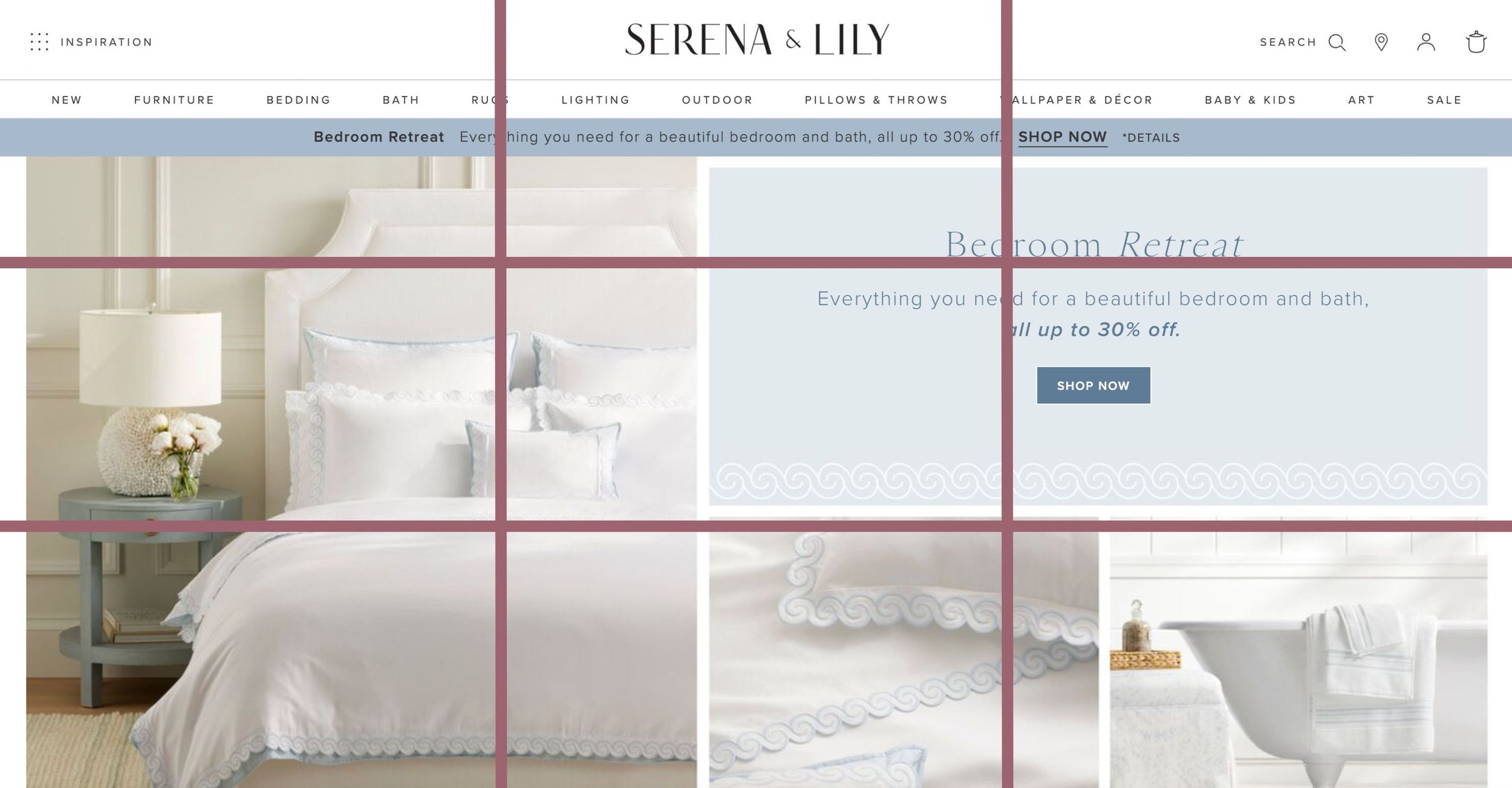
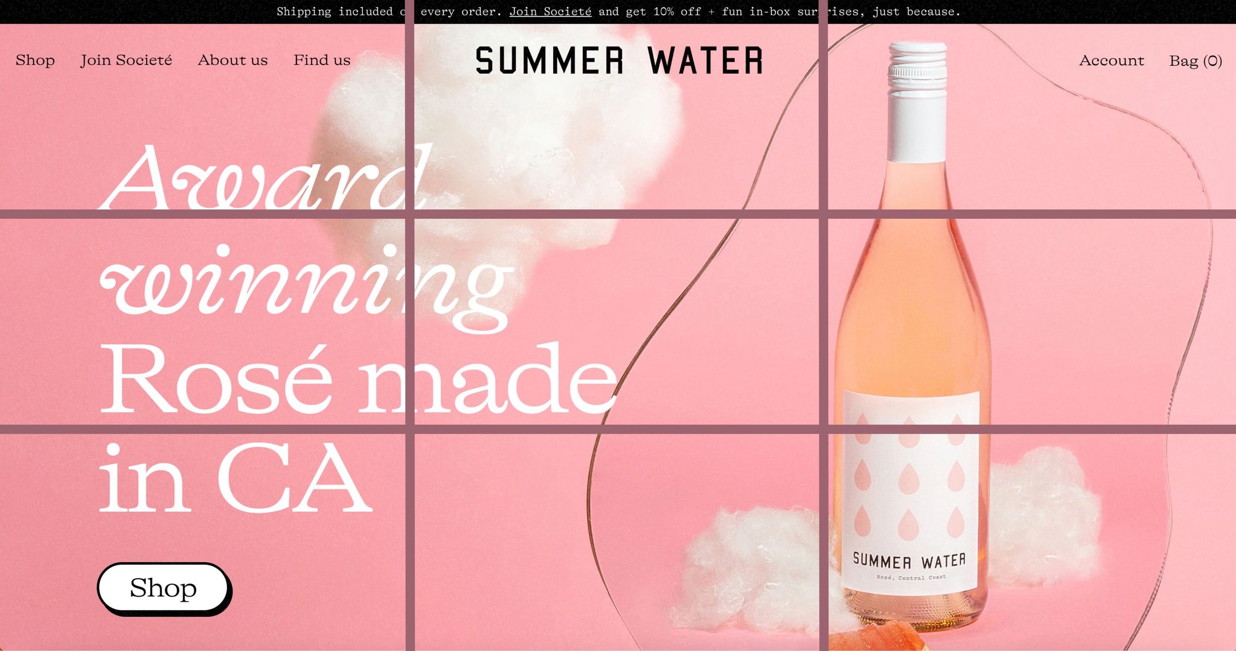
The Rule of Thirds is a photography principle that translates into design of all kinds, including website design. It means you divide an image into a grid of 9 equal squares.
The intersection of those lines is powerful. So if you strategically place images, text, buttons, or other focal points at those intersections, you’ll see more impact.
Take, for example, Serena & Lily’s homepage. “Bedroom Retreat” is at the top right intersection. The image of the bedding lies on the left two intersections. Your eyes are drawn to these areas.
Or take Summer Water’s homepage as another example. Their headline lies on the two left intersections while the bottle of wine lies on the two right (or close to it).
Go ahead and scroll through your site. Imagine there’s a 3×3 grid on your screen, and see if there are any buttons, headings, images, or other important elements that you can move towards one of those 4 focal points.
#11 — Consider the F-Pattern
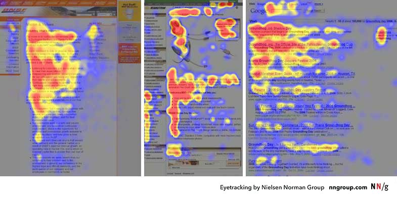
A ton of research shows that most website visitors naturally skim a website in an “F” pattern. If you look at a heatmap, you’ll notice the pattern the user’s eyes follow as they look at a webpage. The pattern looks like an F.
Most people read from left to right, from top to bottom. That means they’re not really looking at the page’s right side or the bottom. (Side note: but on desktop, even if their eyes are hanging out on the left side of the page, their mouse hangs out on the right side. This is why you want your biggest, most important link in your top navigation to be all the way to the top right. Even if you start with a simple Squarespace template, you’ll find that most of them will have your Contact link, or another most important link, as the farthest one on the right).
So, ensure your most essential CTAs and most crucial information fall in that F-pattern shape. Put your least important elements toward the lower right part of your page.
The other thing you want to do is keep your website skimmable. Because as visitors are reading your website, they’re still just skimming it. So use headings, subheadings, bullet points, bold, and italics where appropriate. I call this “speed bumping” your copy.
And if you want to dive deeper into heat maps and conversion rates, check out this article from Hotjar.
#12 — Minimize User Input
Kind of along with minimizing decisions for your visitor, you also want to minimize the amount of work and input they have to do on your website.
No one wants to fill out a long contact form. No one wants to fill out a long form for your lead magnet.
I recommend 5-6 fields maximum on your contact form. Only put the essential information, the information you truly have to have, on your contact form (i.e., basic info + maybe one qualifying question). The other questions you need or want answers to? Get them during your Consultation or Discovery Call… or put them in a questionnaire later in your process.
There you go. Now go use these 12 tips and implement on your site and start monitoring your conversions!
you may also be interested in…


